This week, Outsports is joining SB Nation in celebrating as well as deriding the sports jerseys, uniforms and kits that have made us proud, embarrassed and given us reasons to wonder, “what on earth were you thinking?” Today, contributor Ken Schultz breaks down his choices for the best uniform and most underrated uniform in Major League Baseball.
I’m a little hesitant to admit this, but when it comes to baseball uniforms, I’ve got to side with the traditionalists more often than not. No, I’m not proud of this, either. The idea that there’s even a small part of my brain that agrees with John Smoltz on anything makes me want to google the phrase, “How long before Eternal Sunshine technology becomes real?”
Nonetheless, when a team keeps the same look across multiple generations, there’s usually a very good reason for that. When it comes to uniforms like the Cubs, Red Sox, Yankees, Royals, Blue Jays, and Tigers, the classic look works because they absolutely nailed it.
(I’d also say the same thing about the Cardinals and White Sox. But I’ll say it very quietly.)
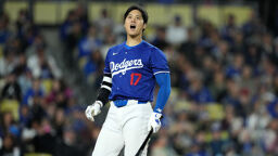
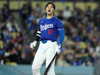
There’s one classic look in particular, though, that serves as my nearly instantaneous answer when I think of the best uniforms in baseball: the Los Angeles Dodgers.
Simply put, every choice the Dodgers made that led to their current look was the right one. For example, blue is the best primary uniform color and Dodger Blue is a more pleasant shade than the navy blue favored by some teams. Dodger Blue feels like baseball. Yankee pinstripes feel like a three-hour trip to the bank.

Set against the solid white of the jersey, the blue of the team name and the red of the player’s number pop. And perhaps most importantly, the “Dodgers” script blending with the blue underline is perhaps the most joyful flaunting of a team name in any sport. It comes across as what would happen if a team asked John Hancock to design their logo.
The Dodger colors provide a sense of dignity while the script mixes in a sense of fun. As if to complement all this, the two traditional Dodger caps add the right iconic touch. The interlocking “LA” is seamless and the traditional Brooklyn “B” embodies the word “classic.” I also love that the team embraces their Brooklyn past and sells the “B” caps at Dodger Stadium—though I know this opinion probably isn’t shared by residents of Flatbush or Prospect Park.
Finally, here’s the best compliment I can give to the Dodger uniform: there is no jersey in baseball that looks better with the number 42.

Or, for that matter, when worn by other trailblazers like co-owner Billie Jean King.

Hell, it even makes Tommy Lasorda look endurable. Almost.

Whether at Ebbets Field or Dodger Stadium, the Dodger uniform is the visual equivalent of Vin Scully narration. It’s absolutely perfect.
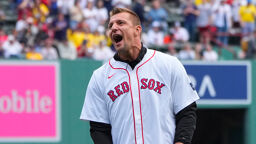
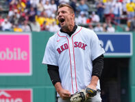
MOST UNDERRATED: At best, I’m ambivalent about almost every MLB alternate jersey. When I see most teams in their alternate tops, all I can hear is Mel Brooks as Yogurt proclaiming, “MERCHANDISING! Where the real money from the game is made!” And I actually got angry when the Red Sox insisted on wearing their awful red tops at home during the first couple rounds of the 2018 postseason.
There are a few exceptions to what is, on the whole, a pretty mediocre spate of third jerseys (and sometimes fourth, fifth, and sixth—I’m looking at you, D-Backs…). The Oakland A’s kelly green unis are justifiably celebrated throughout the game. And the new Padres brown tops with gold lettering look better than any previous incarnation with that color scheme.
But there’s only one alternate uniform that ranks with the very best in baseball: the Colorado Rockies purple jerseys.

When a team has a unique color, it makes sense to flaunt it. And with the Rockies being the only team in baseball that incorporates purple, their alternate jerseys stand out in a gorgeous contrast in a sport that tends to overvalue conformity. Most MLB alternates feel like a team just mailed in their version of a basic red or blue look. Which makes the Rockies one of the few teams that actually excite the eye when they take the field in purple.
Rockies purple is also the only baseball uni I can think of that’s bright without being garish. The color jumps out at you in the same way that the 70s throwback Astros orange alternate does. But — and this is the key part — it’s also exceedingly pleasant to look at, as opposed to making me wonder if the Astros were inspired to cheat their way to a World Series because they voted for Nixon.
Plus, if a team is going to take the field in Prince’s favorite color, it goes without saying that I adore it. I’d like to think I’m a man of exquisite taste.
What are some of your favorite jerseys, iconic or forgotten? Share yours in the comments below!