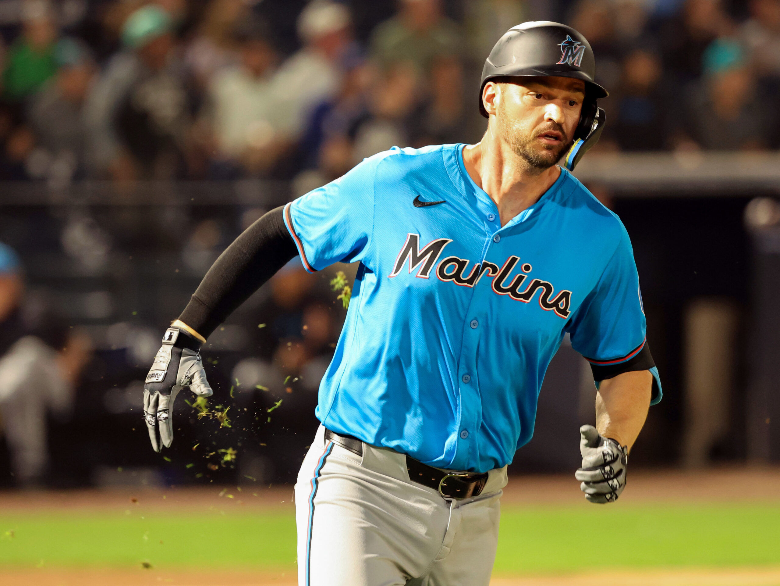
With spring training underway, newly redesigned uniforms by Nike and Fanatics are the talk of baseball — and not in a good way.
Throughout the Cactus and Grapefruit Leagues, players are throwing shade at the new jerseys and fans are being even more merciless on social media.
As a baseball nerd who has harbored a secret ambition to one day be a guest judge on “RuPaul’s Drag Race,” it feels like my ship has come in. So please allow this evaluation of MLB’s new unis to serve as my audition.
Now it’s time for the judges’ critiques. Up first, it’s the Chicago White Sox…
Get off the sidelines and into the game
Our weekly newsletter is packed with everything from locker room chatter to pressing LGBTQ sports issues.
It’s sort of impressive just how bad the new MLB jerseys are through Nike/Fanatics. pic.twitter.com/RLtynhh9kj
— Spencer Gilman (@gilmansg13) February 15, 2024
After more than 140 years, it’s really hard to innovate anything with baseball uniforms but congratulations, White Sox! You’ve invented a new color called “off black.”
If black had a beige, this would be it.
Remember in the early 90s when a cutting-edge rapper like Ice Cube wore a Sox cap in the “Steady Mobbin’” video? This is the White Sox look you’d see on Ice Cube in “Are We There Yet.”
This jersey is begging for anything to distract us from how miserably it fails. It’s not a good sign when the only hope to rescue your look is for Michael Kopech to bring back the Cobra Kai villain ponytail.
Now let’s head to the Pacific Northwest and check out the Seattle Mariners…
Last year vs this year’s replica jersey offerings from the fine folks at MLB, Nike & Fanatics. Last year’s being on the left and this year’s on the right.
— Bobby Mullins (@TheBobbyMullins) February 11, 2024
I have a lot to say, so bear with me here.
Let’s just rip the bandaid off right away with this year’s new jersey offerings pic.twitter.com/3IShhlj0nL
Going into the 2024 season, it appears the Mariners decided to change the names on the back of their uniforms to a font called “CREATE A PLAYER.” Considering the moves Seattle made during the offseason, that might have been an appropriate choice.
These new jerseys are so embarrassing, even the MLB logo looks like it’s trying to escape.
Up next we’re going to Disneyland! It’s the Los Angeles Angels…
Here’s a look at the #Angels 2024 red jersey, with the changes Nike made:
— BTH (@BeyondTheHalo) February 15, 2024
(via TheHaloWay) https://t.co/RDvqFwAqO6 pic.twitter.com/RGP8t1odXI
MLB’s biggest problem is that the league doesn’t know how to market its players. So what’s the biggest change the league makes going into 2024? Shrinking all of their names on the jerseys.
Because the best way to help casual fans identify Mike Trout is to put his name on a uniform that makes them wonder if they have glaucoma.
If you can read the name on Victor Mederos’ back, congratulations! You have passed your drivers test.
Now with one of baseball’s most classic and hard to screw up uniforms, it’s the St. Louis Cardinals…
The new Fanatics/Nike MLB uniforms look like players moms got the jerseys on clearance at TJ Maxx. pic.twitter.com/CFYA6gElEa
— Korked Bats (@korkedbats) February 14, 2024
Oh well.
I guess when you shrink the size of the lettering on the back, the best way to divert attention is to make the rest of the jersey as bulky as humanly possible.
It’s like Kyle Gibson was a Little Leaguer who went to the the ballpark on jersey day and the only size they had was “Cardinals fan.” It’s a bold choice to make a player’s top entirely out of Hammer pants.
This is a uniform made for Babe Ruth after a night spent binging on hot dogs and hookers. Maybe the Cardinals are about to announce a new signing?
In an election year, it’s only appropriate to check in on the Washington Nationals…
Josiah GR AY pic.twitter.com/HempQ38H5D
— Fuzzy (@fuzzyfromyt) February 15, 2024
Poor Josiah Gray. It’s got to be tough learning a new pitch AND how to iron your own name onto your uniform at the same time.
Is it possible to try a team for crimes against fashion?
Finally, let’s visit the Houston Astros…
No chance.. no actual chance pic.twitter.com/vTtlO4dPgr
— Fuzzy (@fuzzyfromyt) February 15, 2024
Well, this is a change. The Astros used to bang trash cans and now they’re pulling their jerseys out of them.
How the hell do you shrink the lettering on every uniform and somehow make it harder to fit a player’s name on the back?! If Justin Verlander’s name were one letter longer, the “R” would be on his right buttock.
I guess when you turn 41, everything starts to droop.
So for the first time in Drag Race herstory, we have a 30-way bottom. (Calm down, Michelle Visage!) I’m sorry, my dears, but you are all up for elimination.
Thirty teams stand before me. The time has come to lip sync for your life. All 30 of you were asked to prepare a lip sync to *NSYNC’s “Bye Bye Bye” — and to direct it at Rob Manfred.
Good luck. And don’t *bleep* it up.


